On September 7, 2016 an extraordinary thing happened. Shigeru Miyamoto came on stage of Apple's annual iPhone event and announced that Nintendo will be releasing a Super Mario game on iOS this year.
It's big news, because it's very rare for a title of such magnitude run on non-Nintendo hardware. Even more so since the company promotes its own new console - Nintendo Switch. It shows that the company is expanding its interests and trying to take a first step into mobile entertainment market. Market which is new to them. One that they do not control anymore - the hardware, the software, nor the distribution and experience. And it my opinion it's visible in their first game - Super Mario Run.
The screens
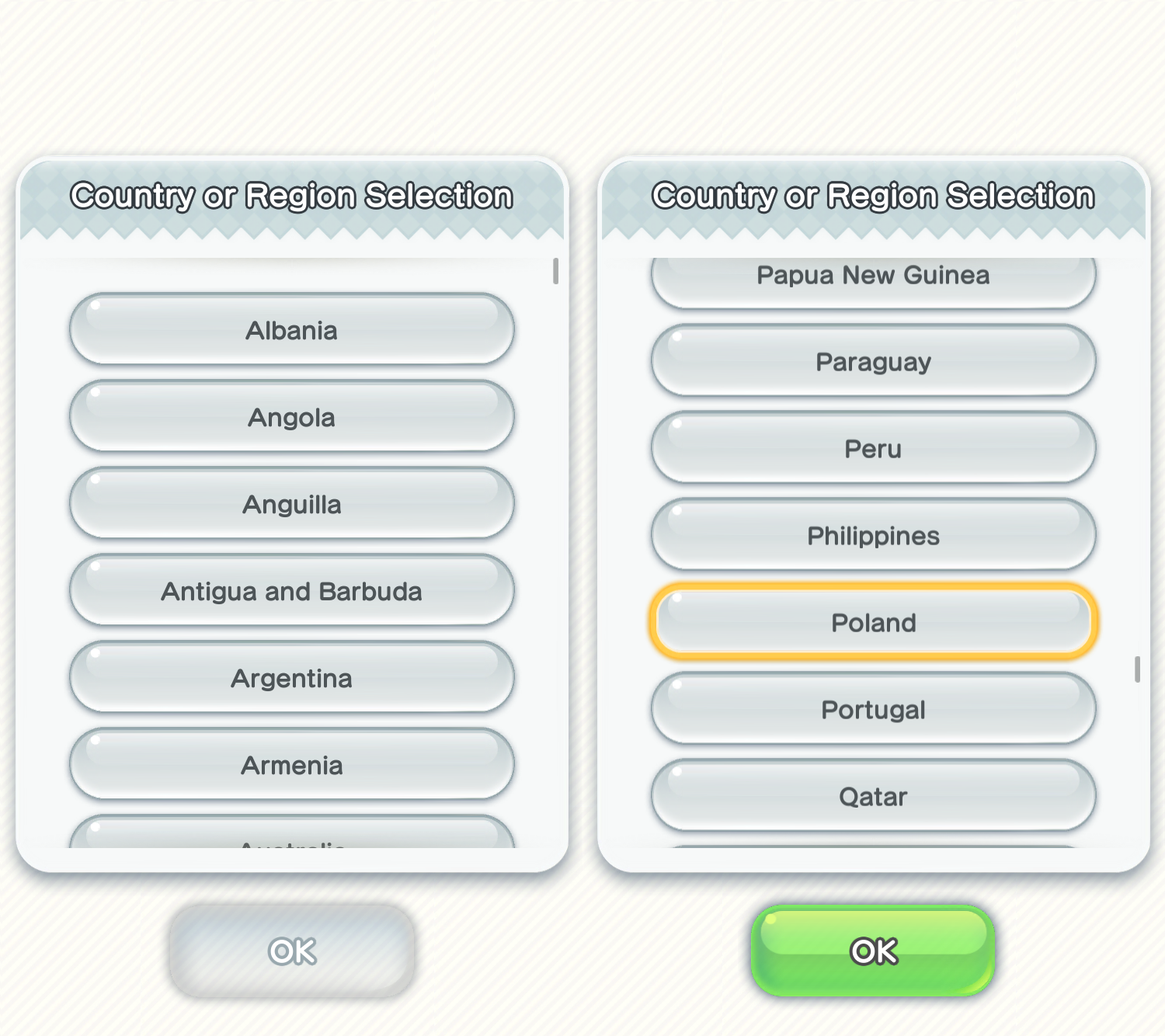
From the very beginning the game feels Nintendo-ish and not something build with iOS at its core. I'm not talking about the bubbly design language, but a fact that the first screen you see is a region choice list.
It's really hard to make this screen any worse than it is. The UI seems like something from Wii where the input method is different. There's no sign of inertia, natural on all mobile platforms. When you touch the screen to scroll you can hear the sound of pressed buttons.
But the worst part is that there should be no such screen. They could read the region from system settings. Or at least provide an autocompletion option, since the device have keyboard. Or stick to just 10 icons of flags, showing all supported languages, instead of 150 countries. All those would be better, but in reality, this screen shouldn't be here in the first place since all the info you need is provided to you by system settings.
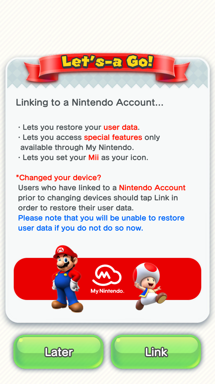
Then you're asked to link with our Nintendo Account. I had (and still have) the Wii but the account I used on it to buy games wasn't the account I could link on that screen. I would have to create a new one using a built in web browser. Again, not an ideal experience.
What are the benefits of having a Nintendo Account?
- We can sync our progress with other devices
- We can setup in-game avatar to Mii
- We gain access to some mysterious special features
I'm not going to guess what the third one means. Setting up avatar is odd, because you are able to choose from few simple ones without registration so this one only expands your options. And to do it you probably have to have some recent Nintendo system or access to separate mobile app, which isn't available worldwide. And let's face it - it's just cosmetics and not a very enticing one.
The real reason you might want to register is to sync your game progress between your iPhone and your iPad. But that's again something which is already built in the system. iCloud provides seemless synchronization between all of user's devices and GameKit provides a simple API abstraction for saving game progress (GKSavedGame and GKLocalPlayer). Just like the region, it's usually setup once for the device, so all applications can use it.
Nintendo decided to not only build their own solution to something that exists but also limit this feature only to people willing to create a separate Nintendo Account. That could be understandable if it would provide additional functionality or would just work better than iCloud does. But it does not. Because funny enough - the important information isn't written in red.
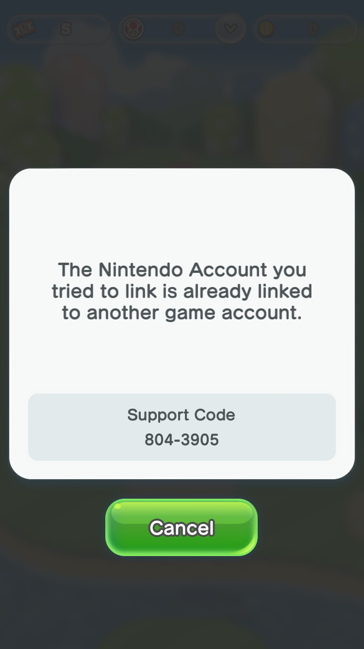
This is the only moment you can link your game into an existing account. Once you skip this screen, you can't login. You can create a new account, but trying to login into an existing one will result in unpleasant error.
The game does not ask you if you want to overwrite your current progress and it doesn't provide a logout or reset option. The only way to link once you're past the second screen is to remove the app from the device and install it again from the App Store.
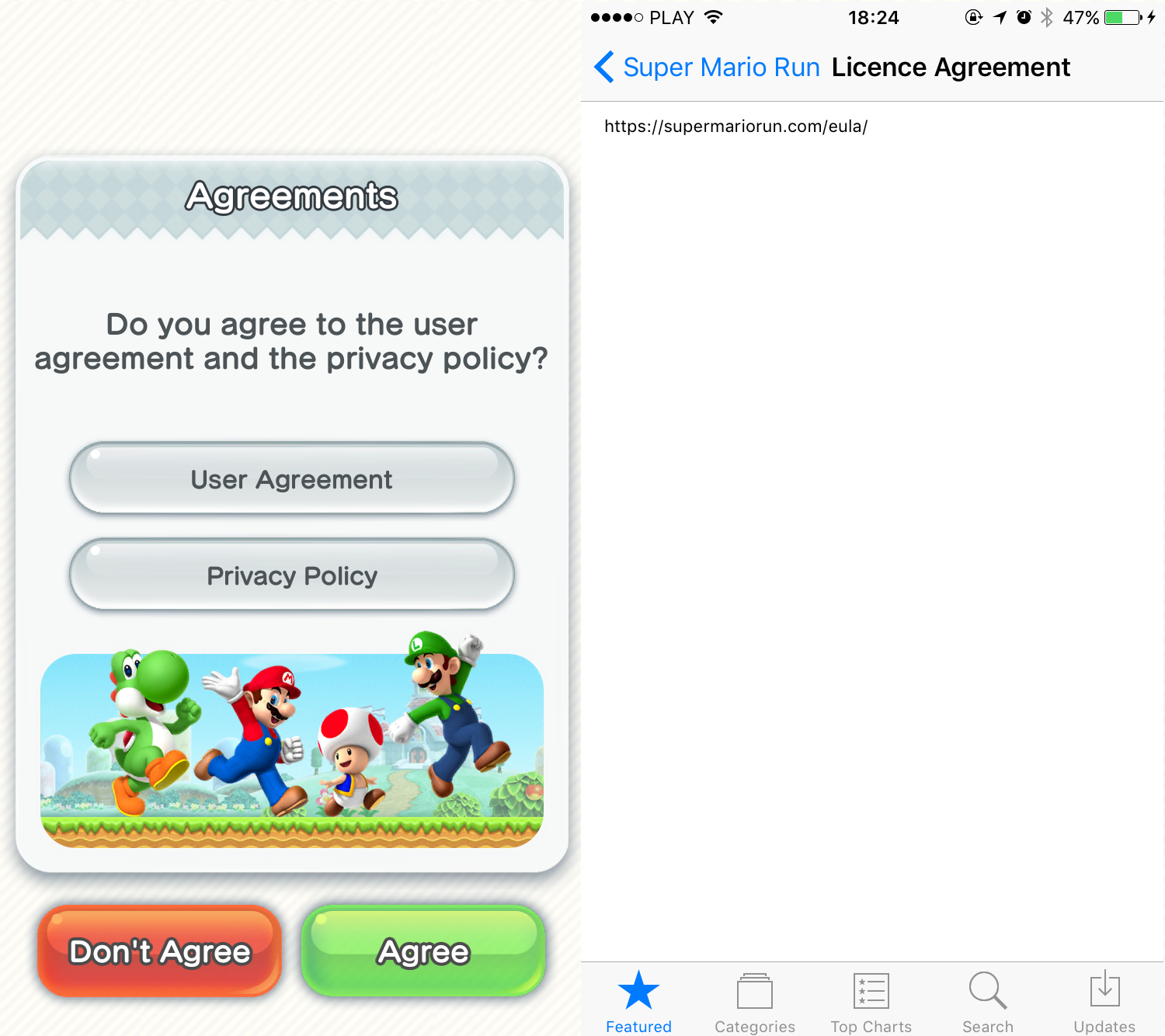
Another already existing functionality, that Nintendo decided to reimplement is User Agreement and Privacy Policy screen. My guess is that when you buy a game for Nintendo console, you might buy it in some local store or on Amazon. Game developer does not have a way to present this information prior to that purchase, so they present it when first launching the game. And fair enough - your game requires always-on internet connection, sends some data back and forth and you want to be clear.
But Apple already provides a way to do this - on the App Store. There are fields where you can provide a full, custom License Agreement or use Apple's standard one. There's also a field to link to your privacy policy. When you download anything from the App Store, it's asumed that you agreed with those terms. Unfortunately Nintendo decided to use the custom license field to provide unclickable link to one and put those as one of the setup screens. This has pretty much the same legal binding but much worse user experience.
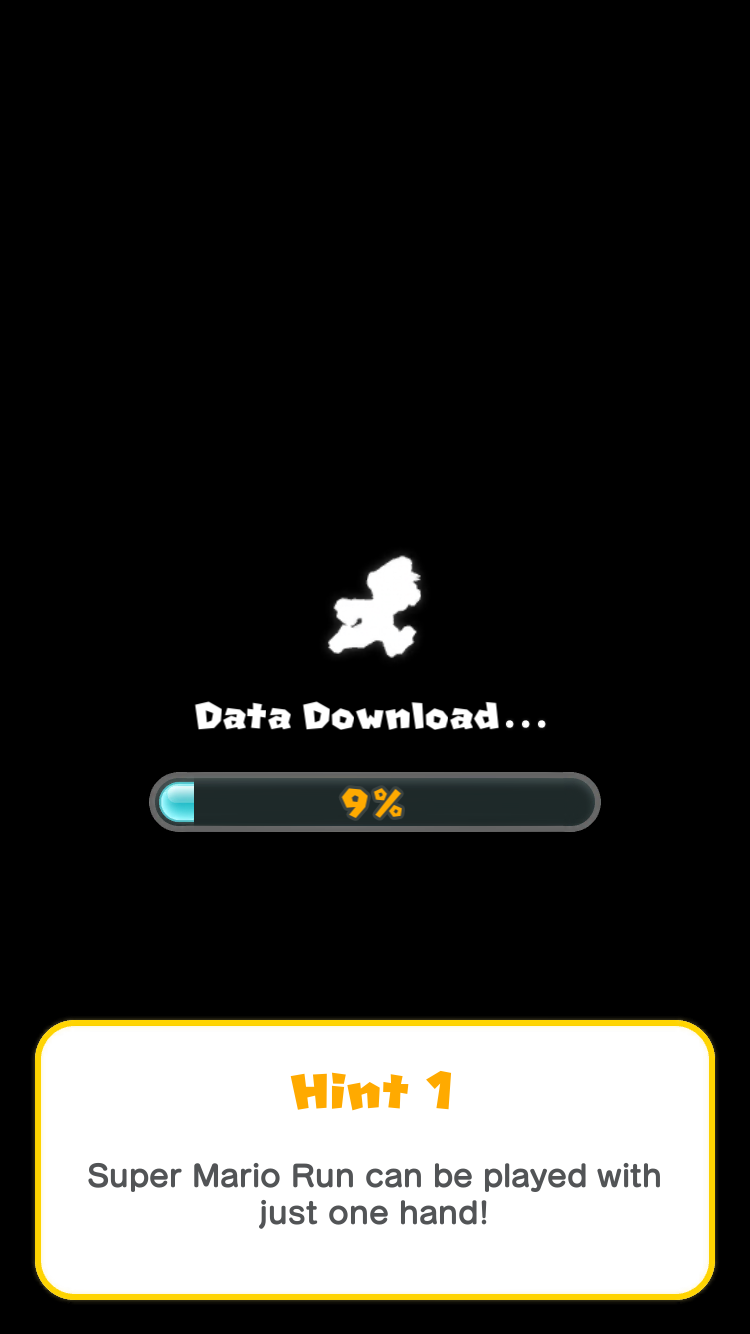
If you don't agree, you can't continue, if you do, you're almost there. You just need to wait for the game to download, of course.
I'm not sure what's happening here. The game on the App Store is over 170 MB, but it downloads another 170 MB of data here. It might make sense in titles like Rayman Adventures which is on the market for a long time and its content changed multiple times, but this is initial release of the game, no new levels or assets were made since Nintendo released it.
Currently Apple allows apps under 100 MB to be downloaded over 3G, if you want to download something larger you need WiFi. But since the game is almost twice as large on the App Store, there's no good reason not to include those extra 170 MB which is being downloaded here and skip another screen.
After the download finishes, you're presented with request to allow Push Notifications from the games, to get notifications like updates about events. It could be worse, some apps just throw all requests for notifications, address book, camera at once, without any explanation. But it's considered a bad design if you ask for those, without valid reason and at the right time.
Here, it just feels lazy and I would probably push the question after you initially experienced the game and with more specific explanation what are the benefits of allowing Push Notifications. Especially since if user won't allow it on initial request, there's additional hassle to enable them in the future.
Finally
After all those screens, you finally get into the real game. Kind of. Super Mario Run follows a poor game design of unskippable intro/tutorial.
The problem with tutorial is that it's a lazy approach to teaching user how to play the game. You are pointed to elements on the screen that you have to touch in order to continue. You can't skip it, you can't tap anywhere else to dismiss that "hint", you just have to follow the instructions on screen, launch first level and only then you can quit it. While tutorials like this are important for people not similar with the game, they are often boring and irritating to people who just want to play. Especially that Super Mario Run isn't that complicated.
Nintendo used to be really good at doing it the right way. The original Super Mario on NES had brilliantly designed first level which uses the level design to teach everything the user needs to know.
Others also do it, all the time. Thomas Was Alone used story-heavy way of introducing player to its rules, while making the experience fun. Super Meet Boy uses similar approach by designing small levels which, while challenging you, also teach you moves and skill that you'll need to finish the game. Portal does a mix of both - requiring precise, complicated skills, but mixing it with game narrative.
And one could argue that all those games need more explanation and mastering of controls to enjoy and beat.
The conclusion
All those screens and interactions is something that you experience when you first run the title. It's a hard wall you hit for initial experience. Especially if you realise that with none to very little effort, most of those could be avoided.
You could download the app from the App Store, tap on the icon and you could just start to play and enjoy the game. No need for region selection, no need for account setup (or not as a first thing you're asked for). You already agreed the the license when you downloaded the game from the App Store. And you could have already all initial levels and assets within the game, so you could play the "demo" part of the game, without seeing additional download screen.
Overall it's hard to say that the initial experience is good. You do have to struggle to play the game. And the fact is - the game is pretty nice from that point on. It's something that you can enjoy and is well prepared for mobile experience. Levels are bite-sized so you can play on transit or when you have few minutes to spare. There's fair amount of replay-ability built in: both to get better but also by having multiple challenges presented. There's an easy to learn, hard to master approach in the game.
It could have been much better experience if a little more extra effort would be put into it.
For me it's an indication that Nintendo didn't do their homework. At least not well enough. If you're in charge of both - making games but also making a whole hardware platform those games run on - you make the rules. For example the Wii is largely experienced the way Nintendo designed it to be experienced. Accelerometers in the pads are used as steering wheals instead of D-pads or analog sticks. You jump and wave your hands in front of the TV instead of just sitting on the couch. People are buying buying it, because of that experience. They don't start the console to play Battlefield, they have it as a party entertainment system.
If you are in charge of designing these experiences from start to finish, you might believe that same rules apply everywhere. You might believe that Mario defines the experience on iOS, not the other way around. But the truth is people buy their phones for different reasons they buy your family console. Your game is just a few minutes distraction from 20 other things that they use their mobile device for. You have to adapt, change your way of thinking, change your approach, look at what other people are doing well on that platform and think if you could use it in your product.
I'm afraid that Nintendo might lived in their own bubble. A bubble filled with people willing to buy 8th edition of Mario Kart or 8th generation of Pokemon game. They lived in it long enough so they failed to realise how much the world have changed, how mobile market is different and that "the good old way" might not be that good anymore.
That is also partially the reason for low ratings of the game, but that's a story for Part 2.
Now imagine - you could just tap that red icon on your screen and Mario would just run!
